
Logo Collection 2022: top four
This year I expanded into logos, it’s one of my favorite things to do, creating iconic glyphs to symbolize a company. The following post is a small batch of logos I created over the year featuring work from the Grand Rapids area and beyond using my network to find clients.
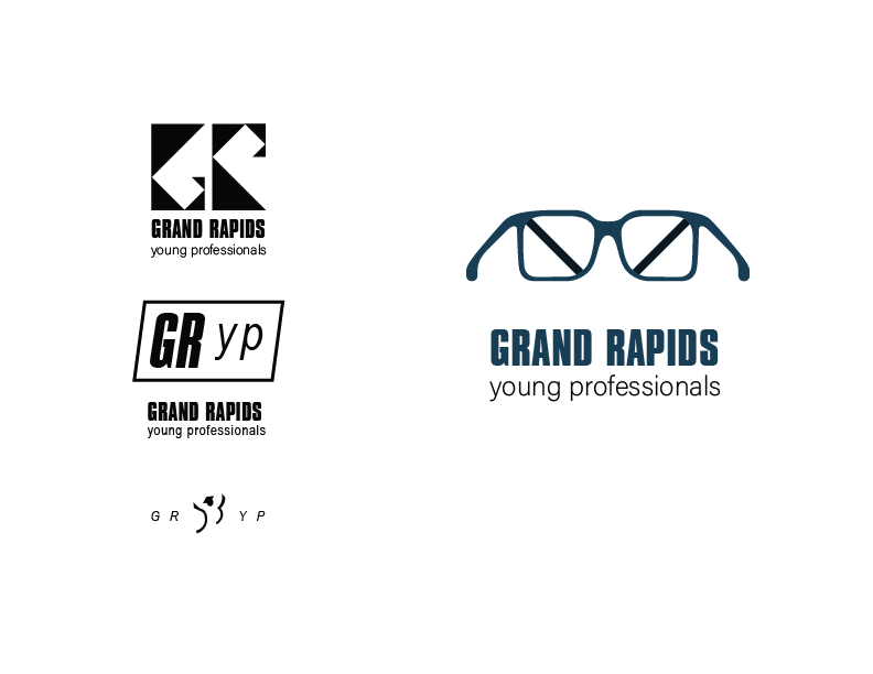
GRYP was looking for a new update from their previous logo featuring the riverfront skyline of the city. It’s tough to distill a city’s culture down to a single logo while also including the “young professional” part. The geometric logo hearkens to Art Prize emphasizing creativity among youth, the emblem is similar to the style of a popular phonebook logo showcasing it as a repository of talent, and the final logo on the left exudes child-like excitement of recent graduates from trades schools and colleges alike.
I settled on the utility of a bridge and glasses. Young professionals see the future and will become it eventually. They are also the ones connecting the commerce of the city to itself.
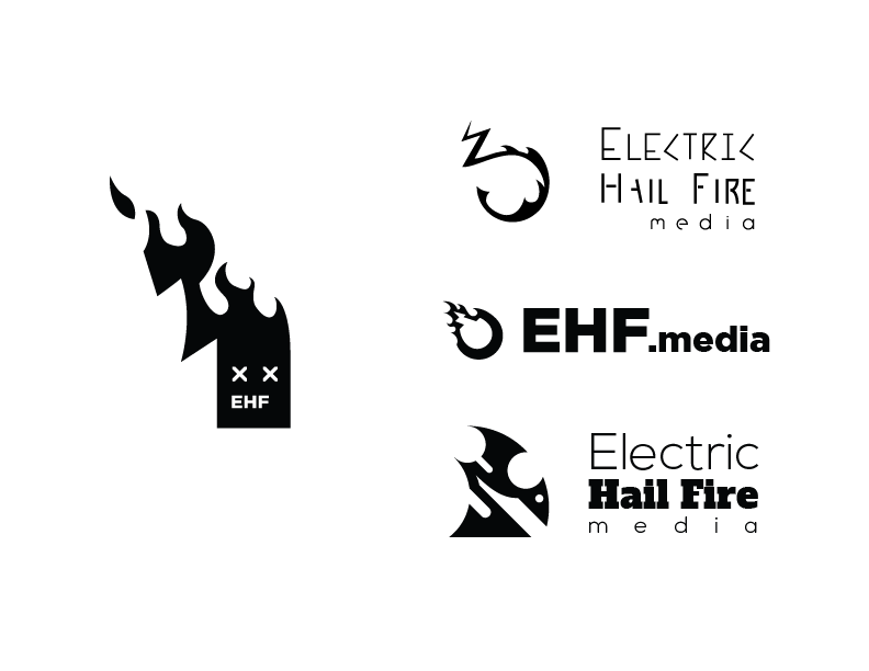
EHFM is a company that is publishing magazines detailing indie culture.. This was a fun, passion-fueled project where I used my vectoring skills to come up with several organic fire-type logos. We pulled inspiration from my earlier work creating flowing organic lines that imply motion through their juxtaposition as a starting point.
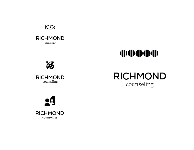
Richmond Counseling is a unique service in the Grand Rapids area that specializes in EMDR (Eye Movement Desensitization and Reprocessing) therapy. The basics of the therapy have you recalling memories of the past that have troubled you guided by a therapist while using external and internal stimuli to cleanse your mind of the strong emotions associated with the experience.
The three logos on the left feature a monogram with an eye, an abstract “vibration”, and a mirror reflection of oneself.
The final logo we chose was a utility piece that could be used by clients when outside of a session to process smaller events that happen in daily life using a principle of design. The eye doesn’t like to move through lines, it tends to stop and follow them, so by looking from side to side at this logo you can effectively “vibrate” your eyes causing them to become tired and effectively simulate the same feeling as a physical vibration.
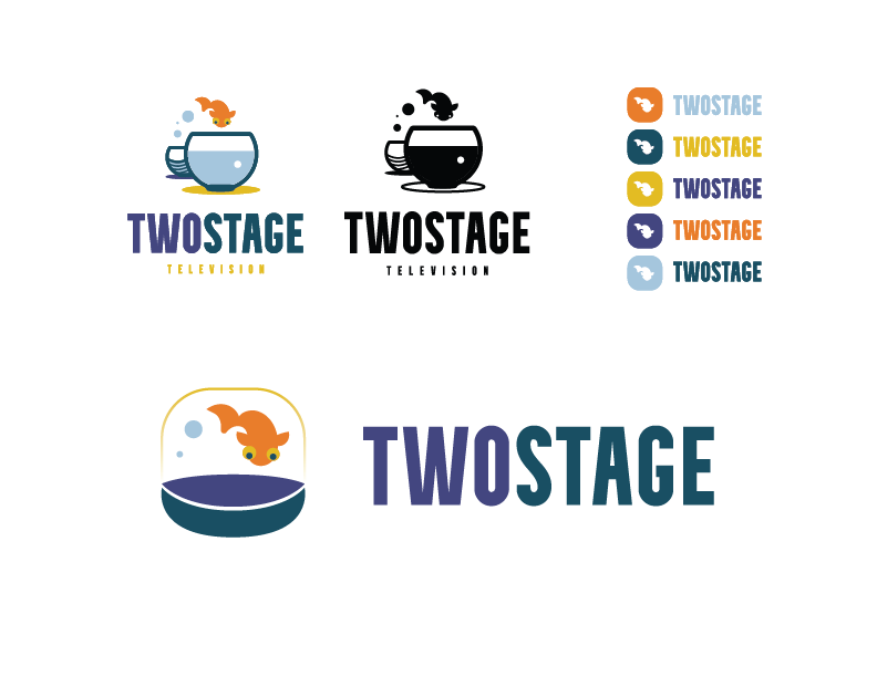
Two Stage is a broadcasting company that features two indie channels, music and film. They came to me with a rough vector version of a fish jumping between two bowls. From there I compressed the initial logo into a semi-3D look, and then I compressed it further into an icon that would work best to be saved on a smart TV or phone.